
TZIKI SOUVLAKI
Website redesign of a local Greek restaurant in order to boost restaurant awareness and solidify brand identity.
PROJECT SCOPE
Responsive web redesign
ROLE
UX Research, UX/UI Design
PROJECT DURATION
65 hours
THE COMPANY
Tziki is a casual Greek restaurant in NYC that opened Fall 2024. They specialize in gyros and offer vegan and vegetarian options alongside their signature roast pork. They have a strong customer base already and have been featured on popular media outlets such as Eater, Infatuation, and the New York Times.
THE GOAL
To create a compelling website that reflects their brand and clientele and is compatible with the Square platform. The current site is aesthetically disconnected and difficult to navigate, so they could benefit from a redesign not only to strengthen branding, but to improve the user experience.
RESEARCH OBJECTIVES
Through surveys and user interviews, I set out to understand users’ main objectives when visiting a restaurant’s website, as well as learning what can sway them from looking online to ordering.
METHOD #1: COMPETITIVE ANALYSIS
A deep dive on similar restaurants to find the standard features being offered by other fast casual establishments. This allowed me to gauge what information, functionality, and aesthetics customers are currently accustomed to seeing.
METHOD #2: USER INTERVIEWS + SURVEYS
Focusing on people 18-65 who regularly eat out in the NYC area, whether that is through meal delivery services or in-person visits. This was to understand how restaurants are discovered, what information is most important, and what can make-it-or-break-it when determining where to eat.
RESEARCH FINDINGS
I discovered that customers value the atmosphere almost as much as the quality of food, further emphasizing the importance of individualism and standing out among the competition.
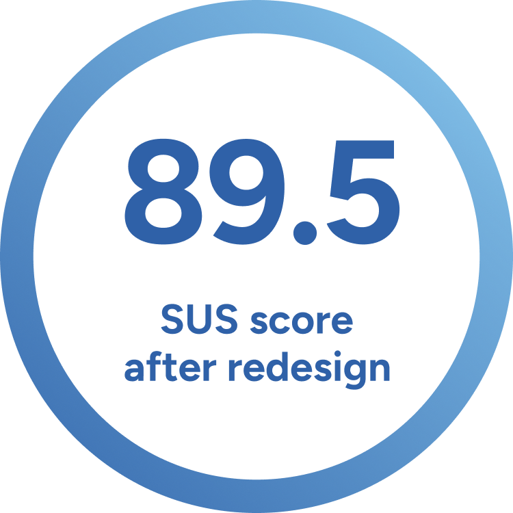
SUS Score: 67.5
This score was mainly due to users reporting that online ordering was unavailable. Other complaints included lack of pricing on the menu, insufficient imagery, and absence of branding and professionalism.
While users typically did not click on extraneous pages like Press or About, they were a standard on competitor’s sites. Users had few requirements when visiting a restaurant website, however if those expectations were not met, they would not patronize the business.
USER EXPECTATIONS
MENU WITH PRICES
All of those interviewed wanted to know what food assortment was offered and for what price. Although each individual had their own metric for a good value, they used pricing to determine when and what occasion to visit.
COMPELLING PICTURES
Interviewees said that pictures could be the deciding factor when trying a new restaurant. Photos allowed them to answer a wide variety of questions like how fancy is it and what are the servings, as well as who to take and what to wear.
CLEAR DIETARY RESTRICTIONS
Whether due to their own allergies and dietary preferences or someone they know, there was a strong desire to have clearer indicators. Vegan and Vegetarian do not have a standard icon or abbreviation so having a key to clarify is crucial.
Target users may choose a restaurant for different reasons, but they both craved centralized, easy to find information. Searching multiple apps for the menu and pricing could deter them from trying a new spot and order from a restaurant they are familiar with.

Persona #1: Focused on finding restaurants that can accomodate their dietary restrictions.

Persona #2: Looking to discover new restaurants for a specific occasion and location.
Based on the research feedback and competitor landscape, I narrowed in on two main opportunities to address.
HOW MIGHT WE…
highlight various dietary restrictions so customers can feel confident in what they order?
translate Tziki’s physical aesthetic to their online presence to establish it as a dining destination?
ADDRESSING USER NEEDS
Focusing on user expectations, I wanted to address their main concerns with stronger branding to give the site legitimacy and a more compelling aesthetic.

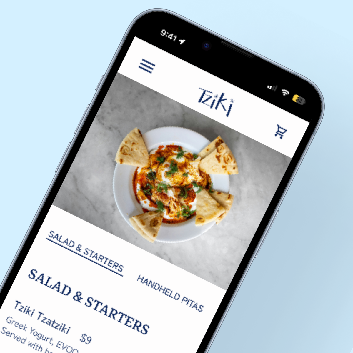
Since every user sought the menu, I wanted to focus on creating a more informative and sleek menu page. Including prices, full ingredient lists, and dietary restrictions made it more accessible for every customer.
1. MENU PAGE
Lofi wireframes focusing on detailed product descriptions.

Photos of each category give customers an idea of what to expect without cluttering the page with individual photos of every item.
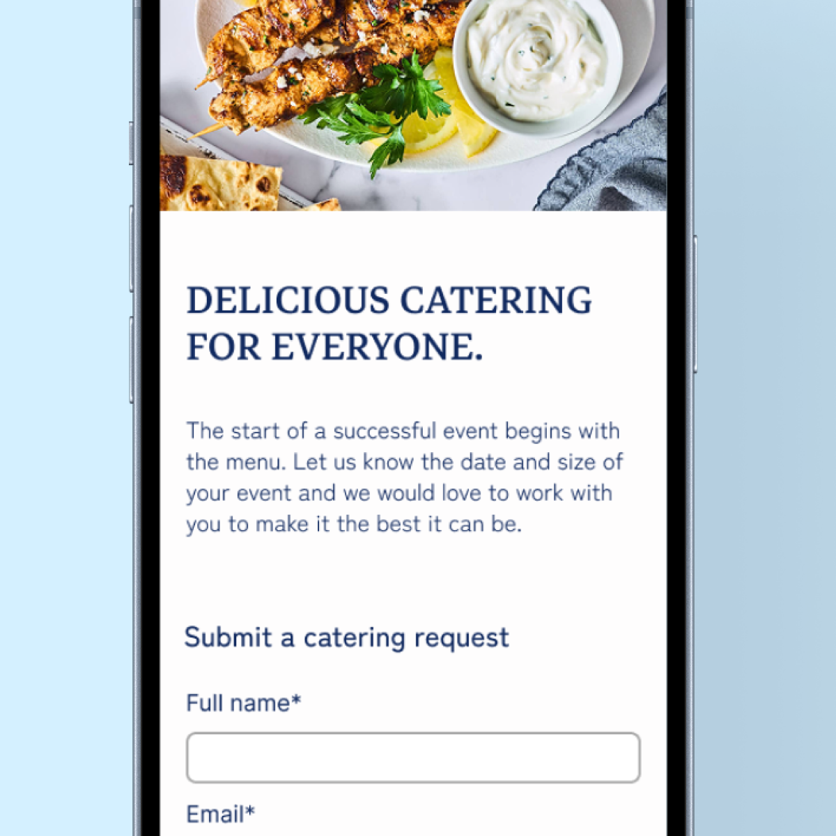
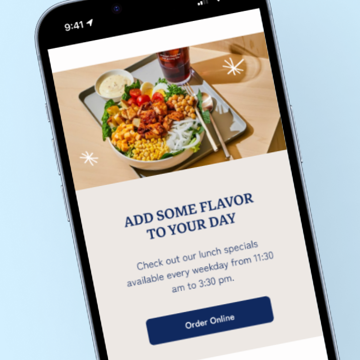
When observing customer behavior, I found each user scrolled down the homepage on their initial visit. Not only did I want to provide all the commonly searched for information - hours, location, menu - on one page, but I also wanted to highlight additional information like press, lunch specials, and gift cards.
2. INFORMATIVE HOMEPAGE
Less crucial features like Socials and Press will follow the Hours and Location information.
More photos add visual interest in addition to the brand graphics that show more Tziki personaility.
BUILDING THE BRAND
Tziki has a strong individual aesthetic in the restaurant that is not reflected in their online presence. I wanted to make sure their website clearly showed the customer who they are and what makes them unique.

LOGO REDESIGN
I switched out the thicker secondary font with a more modern style that looks more elevated. I also increased the thickness of the “Tz” in order to be more scaleable.

GRAPHICS
The focal point of the restaurant is a painting by Cretan artist, Alexandra Manousakis. Imagery from that is reflected throughout the physical space, from the outside sign to their gift cards. I wanted to incorporate it into the website to help link the physical with the virtual.

PHYSICAL MENU REFRESH
By highlighting customer favorites and dietary restrictions, customers can easily navigate the menu. Adding the lunch specials will better advertise that offering whether for now or a future visit.
TESTING OBJECTIVES
VALIDATE SITE IA
To ensure users can easily find hours, location, and menu make the most sought after information easy to find
CONFIRM COPY
To determine if menu copy is clear and Square checkout UI is easy to navigate.
APPROVE BRANDING
To gauge how users perceive Tziki’s aesthetic and see if it has an effect on the likelihood of them ordering.
USABILITY RESULTS
I was extremely pleased with the response to the redesign as all the users walked away with a positive impression of Tziki.


As a metric for the redesign, I asked users:
“DESCRIBE TZIKI IN 3 WORDS”
The most popular responses were QUALITY, UNIQUE, TRENDY, and CLEAN.
ITERATIONS
Overall users had very little feedback, however there were a few instances in the online ordering process where the item details and modifiers created confusion.
SWITCHING DESIGN PATTERNS + COPY
There were some required inputs that did not have the proper design pattern - changing the checkbox to a dropdown for the required modifiers solved that issue. I also cleaned up the verbiage so it is clear what ingredients are already on the item vs. being added.
FINAL PROTOTYPE
TAKEAWAYS
Working on an established business presented exciting opportunities to integrate their unique brand personality with the Square platform. I wanted to ensure that customers would get a sense of Tziki’s ethos since individualism is key to standing out in the competitive NYC market. And fortunately it worked; the significant jump in SUS scoring shows that users responded very positively to the new site.
One roadblock I encountered was the lack of cohesive photography. Initially I wanted to utilize as much of their photography as possible, however I opted for stock photos instead to showcase the importance of quality photography. Current images can be easily be subbed in, but I wanted to provide references of content and art direction for future shoots.
